

Hello fairy followers,
It's been a while! Over 12 months I just realised. Eek! Almost impossible to believe that I haven't had anything to say in that long. (It's not true of course - I say plenty. I may not have had the time to share it with a wider audience.) I'm bursting into print now though, because there is something that I really want to talk about.
Show photos.
I've been floating the idea of having an informal workshop/get-together around shooting and selecting photos for entry into local Shows. With one thing and another it hasn't come to pass. One of my pet peeves is not following through with something you say you will, and it annoys me even worse if it is in fact me who is not doing the following through. To let myself off the hook I thought I'd share a few tips and take it from there.
I'm by no means an expert, but I have judged a couple of Shows and I've noticed a few things that seem to appear regularly. If any of my observations and responses can help you feel more confident when selecting images to enter or indeed setting out with the specific purpose to shoot images for entries then the result is likely to be an increase in quality and volume of entries. I'd love to see the Photography section at the local Shows get bigger and bigger!
This is an assumption, and I'm happy to be corrected if I've got it wrong... the majority of entries are chosen from images previously captured that appeal and you the find a class or category to enter them into because you like them. (That's exactly how I started.) Perfect. You should like what you enter. I'm only suggesting a few ways to scrutinize the shortlist to perhaps choose between images to enter, or alter an image (eg. crop from 4x6 to 8x10 ratio). The tips I'll share in this blog post are things that might have been the difference between first and second when I've been judging.
Composition
The first thing I want to talk about is composition. This is how your image is set out and put together within the frame. A well composed image is easy to look at.
I feel that the biggest barrier here is that we tell ourselves "that's what it looked like when I saw it", so you explain away the bit of foliage hanging in the corner of the frame that you didn't notice when you first captured the shot. "That's how it looked - nothing I could do about it without "faking" it in Photoshop." (The idea that Photoshop only produces a fake image could be another blog post topic, so I won't address that one right now.) Not exactly true. If you're aware of a couple of things that impact good composition you may be able to take a step to the side or move up or down to give a slightly better (cleaner, clearer) perspective.
A few things to think about when composing your shot…
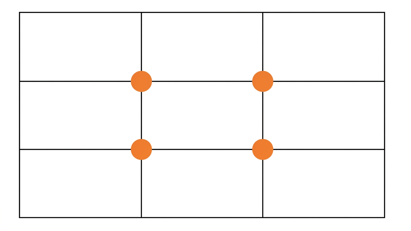
Rule of Thirds. Imagine a three by three grid across the frame. Positioning a subject on the points where the thirds intersect will create an aesthetically pleasing image. Most cameras will let you show the grid in the viewfinder, perhaps even phone cameras will, but you will get a sense of where the thirds might be with practice.
Give moving objects space to move within the frame. Negative space can be used to provide impact to an important subject. If the thing in the shot has indeed been captured in the act of moving the viewer can clearly see that movement if there is room in the frame in the direction of that movement. Movement is a design element that refers to the way the viewers eye is encouraged through the design. Gentle, easy, flowing movements are more appealing than jerky, erratic movements. (Some artists do lean in to these things for dramatic effect, but for the purposes of this blog let's assume that we're aiming to create an image that the viewer finds easy and pleasing to look at, rather than elicit an uncomfortable confrontation with deep-seated trauma.)
Visual clutter.Check the corners of the frame before you press the shutter for things that could impact your shot by taking attention away from your subject, eg. low hanging branches. Those things can interfere with your visual communication and take away from what it is you are representing with your image. Again, we tell ourselves that it's not authentic if we change things, but I would argue that you don't have to accept things that dilute your message. Can you crop the interfering article out in post processing, do you need to zoom in or can you move in any direction to get it out of the frame?
Framing can be very effective in an image, eg. through a window, or using a branch or log to encourage the viewer to look into the image.
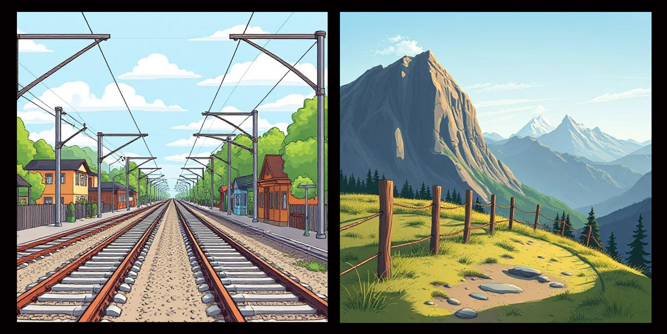
Strong lines in an image draw the viewer's eye. Try and use leading lines to draw the eye into the image, rather than out of it. In these examples I tend to look into the shot along those railway and power lines, whereas, the fence draws my eye along the bottom part of the mountain image and out of frame to the right, completely missing the mountains until my brain lets me know that there's more there that I haven't looked at and I go back to see what it is. That's a little confusing and potentially annoying to a viewer.
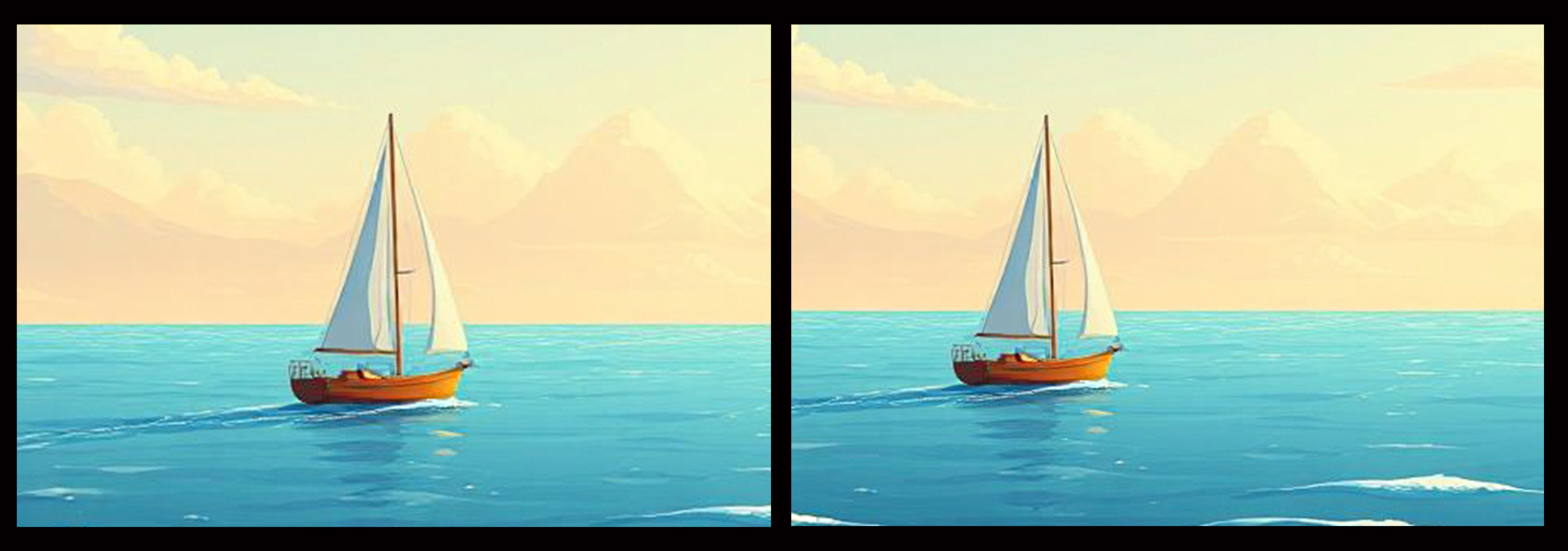
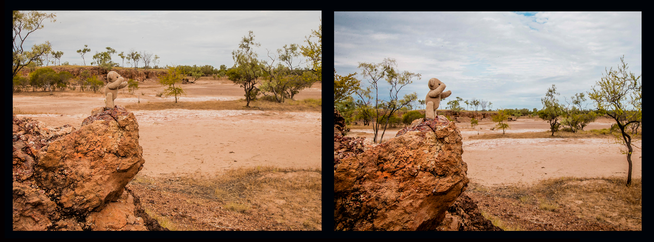
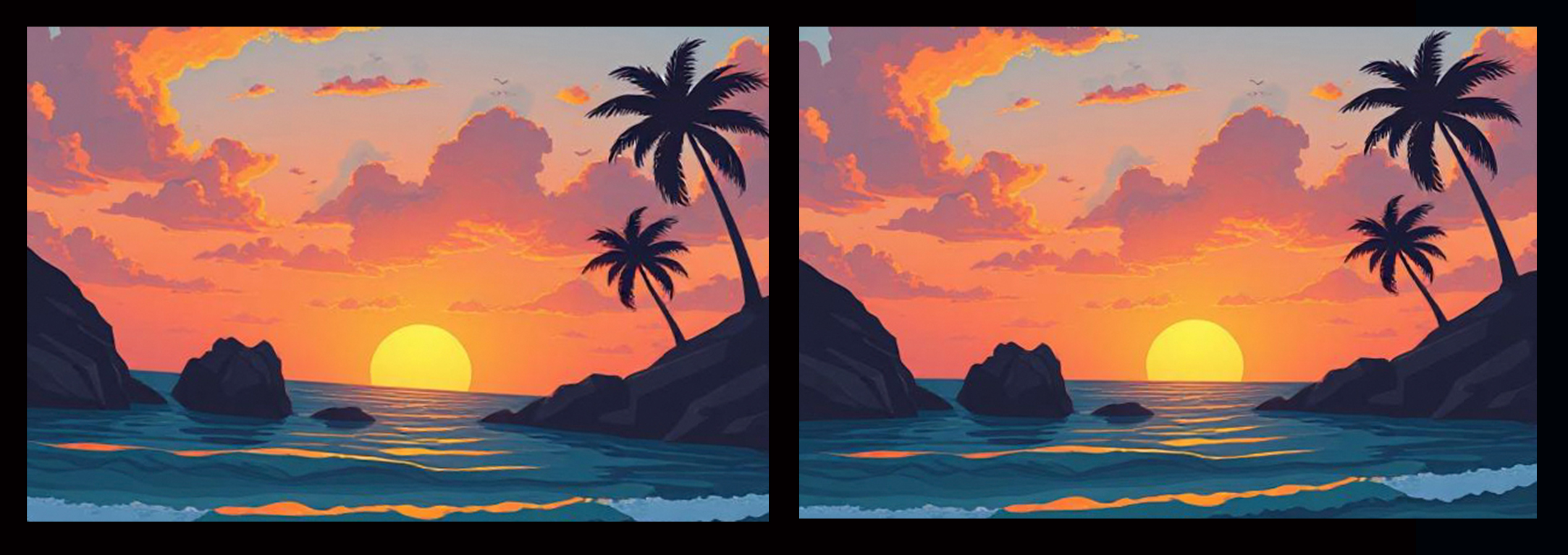
Separate different elements of your image by putting some space between them. This will give your image more depth. An image where elements appear to touch looks flat to the viewer. It might be as simple as a step to either side, crouching lower or standing on something to give you a slightly different perspective. See how flat the first image of Ted looks compared with the second. He is separated from the background and it allows him to stand out more so the viewer can see that he’s the important element in the shot.
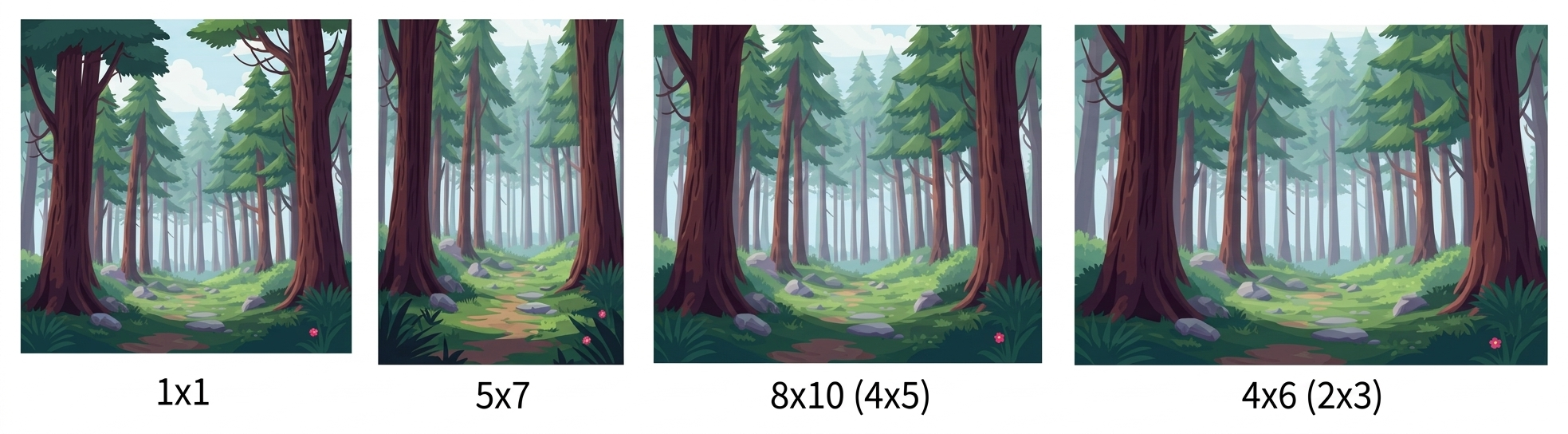
Think about what aspect ratio works best for your image. 8x10(4x5) is different from 4x6(2x3). Most cameras and phone cameras are set to 2x3 as default, however I changed my phone camera to square because that works better for Instagram. The point is, you can change it, and if you do it yourself by cropping how you want to the choice won't be taken from you when you upload the images to be printed.Same shot, different aspect ratio, slightly different ‘feel’ in each of the options below.
Horizon - is it straight? Sometimes this can be deceptive, but straight horizons are always more pleasing to the eye.
Focus - where is the focal point? The 'important' part of the image should be in focus. For portraits, focus should be on the eyes of the subject.
Large objects close to the camera that are out of focus draw attention away from the subject. If it interferes with your visual communication it shouldn't be there. Crop it out, or move so that the distraction is out of the way.
Black and White/Monochrome/Sepia can be very emotive and so effective if done well. These conversions work best when there are black blacks, white whites and lots of tonal contrast and detail. Usually the "auto" conversion doesn't hit these points as well as it could, so I suggest that if you do use the auto conversion, tweak it a bit with contrast at least.
Be aware of what your image represents. What's the 'story'. What are you trying to convey?Being clear about that will help you get rid of the extra clutter that prevents your story being obvious. If there's one thing I learned during my study it's to be intentional in what I do. Even if you're not shooting specifically for a Show category you can still be mindful of why you're making the picture in the first place. It doesn't have to be a complex topic. "For the memories" is perfectly fine. Dig deeper into that though, what aspect of the memory is important? If it's the emotion then the facial expressions and connections (emotional and physical) are the subject. Don't dilute that with extra "stuff" that doesn't need to be there, such as those leaves hanging in the top corner of the frame or that out of focus large object in the foreground that has nothing to do with the emotion being captured. Does that make sense?
The last thing I'm going to say is...
Read the Section rules.
Each competition/Show will have their own guidelines. If it says to secure prints to a one inch black cardboard border for hanging do it, and make sure the print is stuck fast to that cardboard so it doesn't flap or fall off. Some also have size restrictions, but for my money I'm going to suggest that the bigger the print is the easier it is to judge (and the easier to look at). If 8x10 is the largest allowed you can bet my entries won't be 4x6 prints.
Most importantly, make sure you select the most appropriate class for your photo. Occasionally a steward may draw your attention to a better fit, but more often than not they are busy and the photo goes into whatever one you put on the form, whether it's the right one or not. Always double check your entries.
If all of this is a lot can I suggest that cropping be the first thing to focus on (that's a photographer joke)? "Get in close, then get in closer," is advice taken from a photojournalist's quote about how to get the best photos. It eliminates the unimportant or less important 'stuff' that dilutes your message. You don't want to listen to static on the radio interfering with your favourite song, so don't accept clutter in the way of your visual communication.
Thanks for coming to my TED Talk.
Speaking of Ted... R. Edward Bear hasn't been around lately. He's feeling uninspired. Any suggestions for adventures he could undertake?
It's been quite a party, ain't it.
Purple Fairy
P.S. I just realised that the most recent Blog post was about Module 10 of my Diploma course. I did manage to get through the following two modules and am now Diploma qualified to do what I do. There are details on my socials of my exhibition, and of course Ted (the star of the exhibition) has his own socials https://www.instagram.com/ted_on_tour2025/ and https://www.facebook.com/profile.php?id=6157711533...

Leave A Comment
Comments